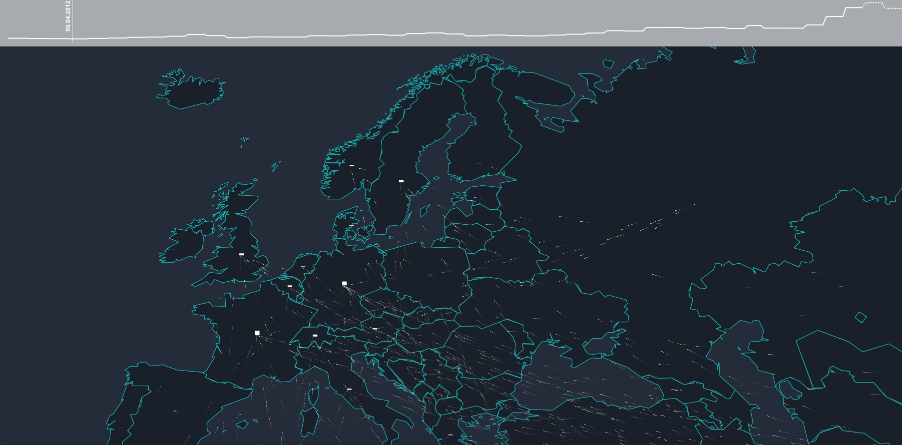
First click on the picture - it will take you to the interactive map.
Each moving point on the map represents 25 people. Only a small fraction of refugees fleeing their homes make it to Europe. Hover over countries to show details. Click on a country to lock the selection. The counts shown on hover represent the number of people who have left or arrived in a country since 2012.
Please feel free to leave a comment or share with others who might be interested to grasp the scale.
Published 26.10.2015 | By Ville Saarinen and Juho Ojala| http://www.lucify.com/the-flow-towards-europe/
Photo by Alessio Lin

